The 5 Es of Content Usability
The Apple iPad has many great things going for it:
- It looks cool
- It’s portable
- It can do a bunch of different things
Know what else is neat about the iPad?
It’s so friggin’ easy to set up and use.
Take it out of the box, turn it on and follow the on-screen instructions.
No complicated owner’s manual. No special activation website you need to visit. No extra software to download.
Just power up and you’re on your way.
Can website content be super easy to understand?
It should be.
Remember, website content comes in a variety of forms:
- Text and copy
- Your contact us form
- Navigation menus
- Special offer pages
All of which must be simple. It has to be obvious and intuitive.
Here’s a classic example:
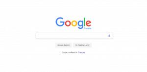
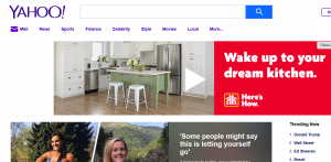
On the left is Google. The right, Yahoo!
Now which search engine is easier to use. Which one is efficient and effective?
Correct: Google.
You know exactly where to go and what to do. Plus, the chances of making a mistake on Google’s home page are incredibly small.
That’s because the Google homepage follows the 5 Es of usability, which were developed by Whitney Quesenbery (a usability expert):
- Effective
- Efficient
- Engaging
- Error-tolerant
- Easy to learn
Let’s take a closer look as they relate to your own website content.
 Effective
Every word, picture, link and call-to-action must be effective, which means it’s:
- Useful: It provides all the information a user needs. It tells them where they are and what they should do next. Most importantly, it does not tell people something they already know.
- Complete: If a user still has questions after checking out your content, it didn’t do its job. People have to get everything they need from it.
- Clear: When you try to be cute, clever or “marketing-y” with your content, you risk mixing up the message or reducing clarity.
- Up-to-Date: Let’s say you’re a home builder. If you no longer offer 100% red bricks and instead offer 98% red bricks, you must update your content. Otherwise, it’s inaccurate and misleading.
 Efficient
Using, understanding and acting on your content must be done as quickly as possible:
- Fast to Find: Whether people search in your main navigation area or through your website’s search box, content has to be served up ASAP.
- Easy to Consume: Use everyday words and phrases people understand. Don’t use complicated words or hard to remember acronyms. Write action-oriented short sentences.
- Concise: Never publish content – whether it’s a blog, image or video – without editing first. Cut out any unnecessary words. They waste space and take longer to get to the point.
- Built Well: The most important information is at the top of your page. Group similar information together (don’t put product or service pricing in the same area as its technical specs).
- Scannable: People don’t read. They scan and skim. Break up your text with headings, lists and tables to make it easy for users to find what they want.
 Engaging
Boring or uninspiring content negatively impacts your WEB ROI if it’s not:
- Attractive: Remember the Yahoo! example above? It’s cluttered, messy and busy. Your content must be clean, uncluttered and spacious.
- Formalized: If your audience is B2B, don’t use teenage slang to come across as hip. If your audience skews younger, don’t refer to them as “sir”, “madam” or discerning.
- Personal: Good content must speak to “you”. It’s not about us, it’s from us and it focuses on what “you” get from “us.”
 Error-Tolerant
If people make a mistake on your website, it isn’t their fault. Rather, it’s because the content is:
- Out-of-Date: Old product information? A navigation menu leading to a broken page? A link pointing to something it shouldn’t? Those are usability mistakes.
- Ambiguous: Imagine you’re a building or landscape supplier. You want your content to communicate that you sell landscaper products and not offer landscape ideas.
 Easy to Learn
Don’t confuse smart with complex when it comes to crafting content people can understand:
- Familiar: Use words and phrases your customers expect to see. If they call them “buses” and you call them “extended, high-capacity civilian movers”, write “buses” on your site.
- Supported: Pictures, diagrams, videos, infographics. All these elements should support and enhance your content whenever possible.
- Comprehensible: Here’s an easy test to run on your website content. Have a grade 6 student read it. If they can’t understand it, it’s too complicated.
Bring the 5 Es of usability to your website
It’s human nature, really.
The easier something is to understand, the more it’s used.
That’s especially true when it comes to your website.
If it’s too hard to figure out, people will leave and go somewhere that isn’t as frustrating.
Getting people to your website is hard enough. Don’t make it easy for them to leave by serving up a bad experience.
Want to learn more?
- CONTACT US with any questions or comments you have
- GET A FREE COMPETITIVE WEBSITE ANALYSIS and see how your site stacks up against your competitors
- DOWNLOAD YOUR FREE COPY of 6 Guaranteed Ways to Drive More Qualified Leads.
 Effective
 Efficient
 Engaging
 Error-Tolerant
 Easy to Learn